When Price Tags Lie: The Hidden Reasons Luxury Pieces Can Appear Cheap
There is a particular kind of disillusionment reserved for the moment you catch your reflection in a department store mirror and realize that the jacket you paid handsomely for looks, somehow, ordinary. Not offensive. Not incorrect. Simply unremarkable — which, in the vocabulary of elegance, amounts to the same thing. You have encountered what might be called the luxury visual paradox: the phenomenon by which price and perceived quality not only fail to align but occasionally invert entirely.
This is not a rare occurrence. It is, in fact, one of the most instructive failures a style-conscious person can experience, because it forces a reckoning with what luxury actually means versus what the industry has trained consumers to expect from it.
The Loudness Problem
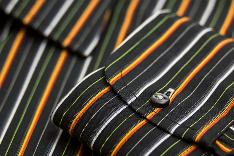
The most common culprit is what might be called decorative excess — the tendency of certain luxury houses to compensate for questionable construction with visible signaling. Oversized logos, aggressive hardware, and conspicuous pattern placement are not inherently vulgar, but they function as a kind of visual noise that overwhelms the eye before it can assess the underlying quality of the piece.
The psychology here is well-documented. When the brain processes a garment, it moves from the most visually dominant element outward. If that dominant element is a brass monogram clasp or an all-over branded canvas, the garment's actual fabrication — its drape, its weight, the precision of its seaming — never registers. The viewer sees the logo and stops looking. This is precisely why a $3,000 logo-covered tote can read as less refined than a $400 vegetable-tanned leather bag with a clean silhouette and thoughtful stitching detail.
The trained eye works in reverse. It begins with the quietest elements and works toward the louder ones, which is why the truly discerning observer notices the weight of a lapel before they notice its width, and the quality of a lining before they process the label sewn into it.
Fabrication Choices That Betray the Price Tag
Beyond decoration, the materials themselves frequently undermine the luxury proposition. The fashion industry has, over the past two decades, undergone a quiet but consequential shift in fabrication standards. Supply chain pressures, quarterly margin targets, and the acceleration of trend cycles have led many heritage houses to introduce synthetic blends into fabrics that were once exclusively natural. The result is a garment that carries a prestigious name but moves, catches light, and ages in ways that signal exactly the opposite of what the price implies.
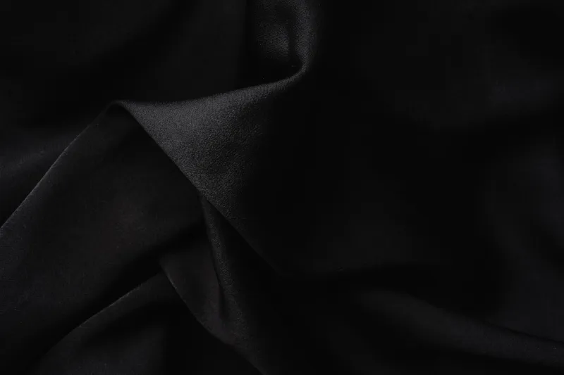
Synthetic fibers, regardless of their technical sophistication, share a visual signature: a particular flatness under diffuse light, a tendency to pill at friction points, and a drape that lacks the organic weight of natural textiles. Wool, silk, and high-quality cotton possess what textile professionals sometimes call "life" — a responsiveness to movement and light that reads, even to an untrained eye, as inherently more valuable.
A cashmere sweater made from long-staple fibers, properly finished, will catch ambient light in a way that communicates warmth and depth. A sweater labeled cashmere but blended with acrylic will reflect light flatly, and no amount of brand heritage can rescue it from that visual tell.
The Styling Errors That Compound the Problem
Even a genuinely well-made piece can be undermined by the manner in which it is worn. Luxury garments are frequently designed with specific proportions, intended silhouettes, and particular undergarment or layering requirements that are never communicated at the point of sale. When those conditions are not met, the garment performs poorly — not because it is poorly made, but because it is being asked to do something it was never designed to do.
The classic example is the structured blazer worn over an overly voluminous blouse. The blazer's architecture — its chest canvas, its shoulder construction, its suppressed waist — was engineered to interact with a specific silhouette beneath it. Disrupt that relationship and the jacket loses its line, bunching at the collar, pulling across the back, and communicating exactly the kind of fit that signals a garment purchased rather than worn with intention.
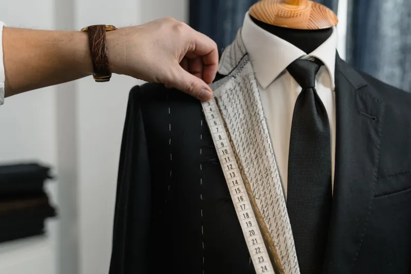
This is why fit alterations remain one of the most consistently undervalued investments in a wardrobe. A skilled tailor does not merely adjust measurements; they restore the relationship between a garment's design intent and the specific body wearing it.
What Genuine Quality Actually Looks Like
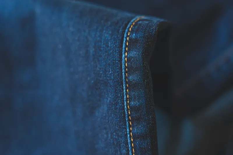
The visual language of true quality is, almost without exception, a quiet one. It communicates through consistency rather than spectacle: the evenness of a topstitch, the precision with which a plaid is matched at a seam, the weight and recovery of a fabric when gathered and released. These are details that require time, skilled labor, and materials of sufficient quality to respond correctly to precise handling. They cannot be faked at scale, which is precisely why they remain the most reliable markers of genuine luxury.
The next time you stand before a garment and find yourself uncertain whether its price is justified, resist the impulse to examine the label. Instead, hold the fabric between your fingers and assess its weight. Look at the interior seams and evaluate their finishing. Find the most technically demanding seam on the piece — typically a curved one, or one that joins two different fabric panels — and assess whether it lies flat, whether it puckers, whether the pattern continues across it without interruption.
These are the questions that separate the connoisseur from the consumer. And the answers, invariably, are more revealing than any price tag.
The Recalibration
Ultimately, the luxury visual paradox is not a failure of expensive clothing. It is a failure of the criteria by which we evaluate it. When perceived value is anchored to brand recognition rather than construction quality, the system produces exactly the outcome we observe: loud pieces that look cheap and quiet pieces that look expensive, with the price tag bearing no reliable relationship to either.
The recalibration required is not a rejection of luxury — it is a refinement of it. It means learning to read garments rather than simply purchasing them, to understand what genuine craftsmanship looks and feels like, and to resist the seductive shortcut of brand recognition as a proxy for quality.
True elegance has never required an audience that recognizes the label. It requires, instead, an audience with eyes trained well enough to see what the label cannot tell them.